How to Effectively Find the Interquartile Range
The interquartile range (IQR) is a crucial concept in statistics that measures the statistical dispersion of a dataset. Understanding the IQR is essential for data analysts, researchers, and anyone involved in data exploration or interpretation. This comprehensive guide will take you through the steps of calculating the IQR, its significance in data analysis, and how it helps in identifying outliers and understanding data variability. Let’s delve right into the details!
Understanding Quartiles and Their Importance
Before we can calculate the IQR, it is essential to grasp the concept of quartiles. Quartiles are values that divide a dataset into four equal parts. The three quartiles consist of the lower quartile (Q1), median (Q2), and upper quartile (Q3). The lower quartile represents the 25th percentile, the median represents the 50th percentile, and the upper quartile corresponds to the 75th percentile. This division allows us to understand the data spread and analyze the variability within the dataset.
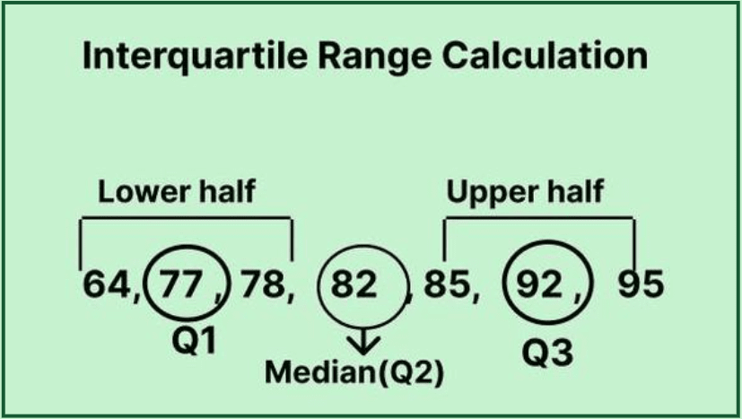
Identifying Quartiles in a Dataset
To accurately identify quartiles, you first need to organize your dataset in ascending order. For instance, consider the following dataset: {8, 9, 10, 12, 15, 18, 20}. The median (Q2) of this dataset is 12. Once you have calculated the median, divide the data into two halves – the lower half for Q1 and the upper half for Q3. In this case, Q1 is 9 and Q3 is 18. By determining these quartiles, you set the foundation for calculating the IQR.
The Interquartile Range: Definition and Calculation
The interquartile range is defined as the difference between the upper and lower quartiles:
IQR = Q3 – Q1.
Using our previous example, we can find the IQR: IQR = 18 – 9 = 9. This value indicates the range within which most of the data points lie and gives insight into the data distribution. By focusing on the IQR, analysts can effectively summarize the data set while minimizing the effect of outliers, ultimately contributing to a more precise statistical calculation.
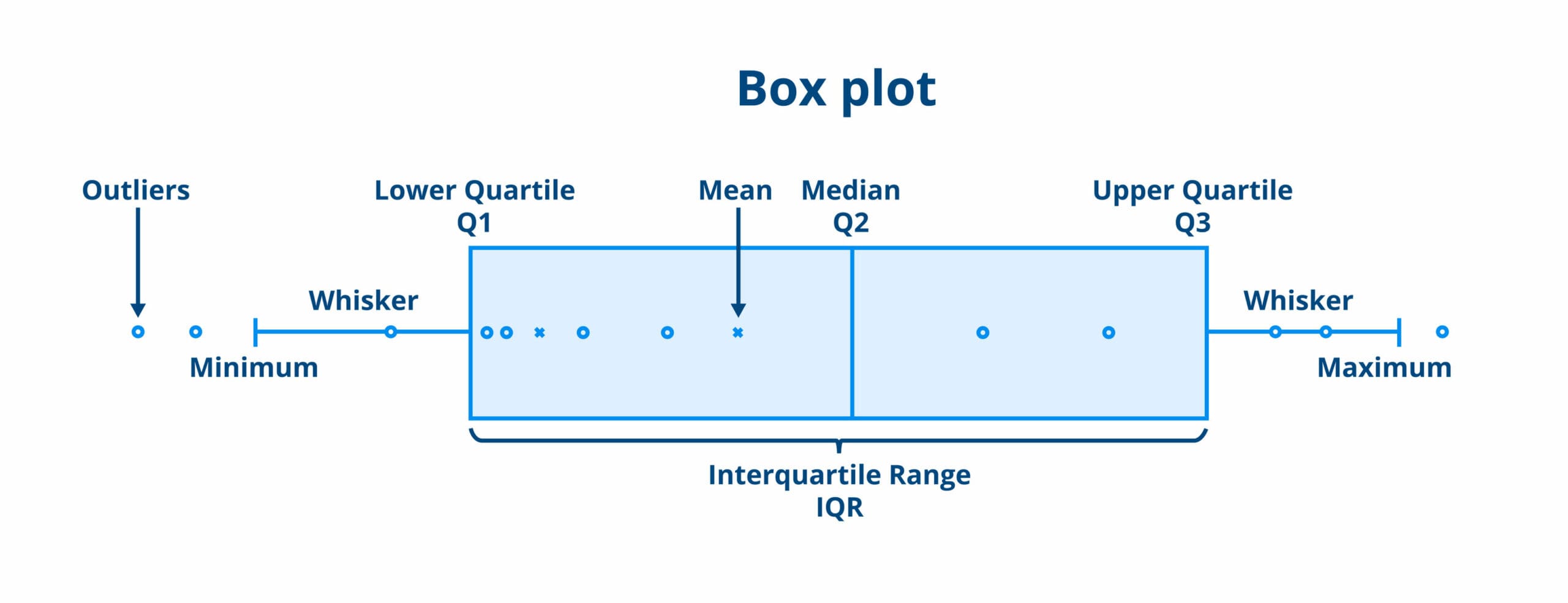
Visualizing the IQR with Box Plots
Box plots, also known as box-and-whisker plots, are a fantastic way to visualize the IQR and the overall distribution of data. A box plot displays the quartiles and highlights outliers effectively. The central box represents the interquartile range, while the lines extend to show the range of the rest of the data, thereby aiding in the understanding of the data spread and identification of potential outliers.
Constructing a Box Plot
To construct a box plot, start by plotting the lower quartile (Q1), median (Q2), and upper quartile (Q3) along a number line. Draw a box from Q1 to Q3, with a line at the median. Then, extend “whiskers” from the edges of the box to the smallest and largest values that are not outliers. Any values outside this range can be marked as outliers. This visual representation makes it easier to analyze data variability and compare different distributions at a glance.
The Role of IQR in Identifying Outliers
Outliers are points that lie significantly outside the expected range of a dataset and can skew results if not properly addressed. The IQR plays a significant role in identifying outliers using the following criteria:
- Lower boundary = Q1 – 1.5 * IQR
- Upper boundary = Q3 + 1.5 * IQR
Any data point below the lower boundary or above the upper boundary is considered an outlier. Therefore, by applying this IQR method, you can ensure your analysis remains robust and insightful, minimizing distortion caused by extreme values.
Calculating the IQR in Practice
Let’s consider a practical example to solidify your understanding. Suppose we have a dataset containing the following ten numbers: {23, 26, 29, 29, 34, 36, 41, 42, 45, 50}. Start by organizing the data in ascending order:
1. Calculate the median (Q2), which is the average of the 5th and 6th values: Q2 = (34 + 36) / 2 = 35.
2. Identify the lower quartile (Q1) as the median of the first half of the dataset: Q1 = (29 + 29) / 2 = 29.
3. Identify the upper quartile (Q3) as the median of the second half of the dataset: Q3 = (41 + 42) / 2 = 41.5.
4. Lastly, compute the IQR: IQR = Q3 – Q1 = 41.5 – 29 = 12.5. This calculated IQR indicates how concentrated or spread out the dataset is around the median, providing insights into the variability of the data.
Applications of Interquartile Range in Statistical Analysis
The significance of the IQR extends beyond theoretical concepts; it’s widely used in various fields for practical analysis. By comparing the IQR across different data sets, one can discern variations in spread and understand whether attempts to normalize certain datasets are warranted. This characteristic proves valuable in multiple learning, research, and reporting contexts while enhancing the overall efficiency of data analysis.
IQR as a Tool for Data Comparison
When analyzing different groups within a dataset, the IQR serves as an effective comparative tool. For example, if two datasets have similar medians but one has a larger IQR, it may indicate a broader range of outcomes. Analysts can perform deeper investigations on the dataset with a wider IQR to uncover relationships and insights into the underlying characteristics and data distribution.
Understanding Variability beyond IQR
Although the IQR offers valuable insights into data spread, it should be used alongside other statistical measures for a comprehensive analysis. Complementary metrics include the standard deviation and variance, which convey how individual data points differ from the median—the greater the standard deviation, the higher the variability.
By employing multiple statistical measures, data analysts can form a clearer picture on variability and interpret results more proficiently. When studying relationships, understanding quantiles, and visualizing using box plots are integral for effective data storytelling.
Key Takeaways
- The IQR is essential for understanding the variability in a dataset.
- Quartiles split data into four equal parts, providing insights into central tendency.
- Box plots visually represent data spread and highlight outliers effectively.
- Calculating IQR helps identify outliers, ensuring robust statistical analysis.
- Comparing IQR across datasets can reveal meaningful relationships and insights.
FAQ
1. What is the difference between IQR and the overall range of data?
The primary difference lies in what each measure reflects about the dataset. The overall range measures the difference between the highest and lowest values, sometimes exaggerating that variability due to outliers. In contrast, the IQR focuses on the middle 50% of the data, providing a clearer picture of variability without the influence of outliers, which contributes to a more stable and effective statistical analysis.
2. How can IQR be applied in the context of data analysis?
The IQR can be applied in numerous contexts within data analysis, such as to summarize variability, identify outliers, and compare the spread of different datasets. For instance, researchers often use it in experimental data to eliminate extreme values and gain insights into the central tendencies and overall variability of their data distributions. Moreover, it’s an essential statistic expressed in descriptive analysis reports.
3. Can I use IQR for any dataset size?
Yes, the IQR can be used regardless of dataset size, as its calculations rely on quartiles. However, smaller datasets may yield less reliable estimates, and the clarity of results may decrease. As such, while analyzing data for high statistical significance, it is often recommended to use sufficiently sized datasets to ensure effective statistical measures.
4. How does IQR relate to other statistical measures?
The IQR is related to several key statistical measures, such as standard deviation and variance. While the IQR provides insight into the middle 50% of the dataset, standard deviation and variance gauge how spread out the entire set of data points is. By using these measures in conjunction, analysts can achieve a detailed understanding of data variability.
5. What tools can help in calculating IQR?
There are numerous tools available for calculating the IQR, ranging from statistical software like R and Python to online interquartile range calculators. These tools often automate the process, allowing users to quickly obtain quartiles, IQR, and visualize distributions through box plots, enabling efficiency in the statistical calculation.